Tom Blog

移动端布局-rem

使用rem很长时间了,一直想好好总结一下,迟迟没有写,太懒大家都懂。。。 当然还有一个原因不会写总结。

在总结rem之前先说一下,之前是怎么解决移动端布局的。
百分比布局

宽度还好说 屏幕宽度100%,各个板块按照计算的比例各种xx%但是高度就不行了没有参照物,图片还好说,背景图、字体大小就呵呵了。只能做到大概。

固宽320px

这种方案简单粗爆,以px为单位该是多少就是多少。但是当手机分辨率越高,两边留白越多 看着很不爽。

rem是什么?

rem(font size of the root element)是指相对于根元素的字体大小的单位。简单的说它就是一个相对单位。看到rem大家一定会想起em单位,em(font size of the element)是指相对于父元素的字体大小的单位。

同样rem也有很多实现方式,不过都是根据rem特性,基于根(html)的font-size大小来做,我见过很多页面 font-size:62.5% 到现在不知道这个是怎么玩的。

为什么选择rem布局。

就是因为可以解决以上问题。这么说是不是有点废话。。。

那就不费话了

首先rem相对于根(html)的font-size大小来计算。

例如:font-size:10px;,那么(1rem = 10px)了解计算原理后
首先解决怎么在不同设备上设置html的font-size大小。
在查看了很多相关rem文章和自己经验后。基本实现原理有两种

1、js 来获取设备宽度。

既然是移动端,我们可以开心的直接不考虑 微软家那几个老儿子
获取设备宽度 rectObject = object.getBoundingClientRect();
返回值是一个DOMRect对象,这个对象是由该元素的 getClientRects() 方法返回的一组矩形的集合, 即:是与该元素相关的CSS 边框集合 。

1
2
3
4
5
6
7
8
9
10
11
//这玩意看着高端又好使
document.querySelector('.box').getBoundingClientRect();
ClientRect {
bottom: 108
height: 100
left: 8
right: 68
top: 8
width: 60
}

这样就能拿到设备的宽度 当然meta 先设置

1
<meta name="viewport" content="width=device-width, initial-scale=1, user-scalable=no, minimal-ui">

这样写的原因是为了设置设备的相对于px的宽度

1
2
3
4
5
6
7
8
9
//chrome 模拟设备iphone5
document.documentElement.getBoundingClientRect().width
320
//chrome 模拟设备iphone6
document.documentElement.getBoundingClientRect().width
375
//chrome 模拟设备iphone6 plus
document.documentElement.getBoundingClientRect().width
414

这样一来 我拿到了设备宽度,完了设置html的font-size大小

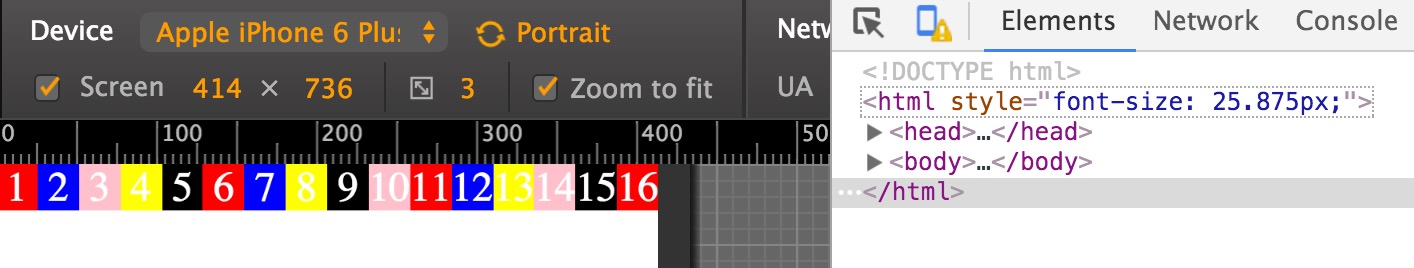
例如设计稿宽度640px,我现在做法是把设计稿纵向分成16份,那么每份是640/16=40px,40px = 1rem
换算成rem就是16rem就等于40*16=640 这样一来设计稿切图时,拿到每一部分的宽度就可以计算相对应的rem值,
例如拿到的宽度是100px 那么100/40=2.5rem 这样就可以按照设计稿的比例显示在设备上

下面我写了一个简单demo


效果图

1
2
3
4
5
6
7
8
9
10
11
12
13
14
15
16
17
18
19
20
21
22
23
24
25
26
27
28
29
30
31
32
33
34
35
36
37
38
39
40
41
42
43
44
45
46
47
48
49
50
51
52
53
54
55
56
57
58
59
60
61
62
63
64
65
66
67
68
69
70
71
72
73
74
75
76
77
78
79
80
81
82
83
84
85
86
87
88
89
90
91
92
93
94
95
96
97
98
99
100
101
102
103
104
105
106
107
108
109
110
111
112
113
114
115
116
117
118
<!DOCTYPE html>
<html>
<head>
<meta charset="utf-8">
<title></title>
<meta name="viewport" content="width=device-width, initial-scale=1, user-scalable=no, minimal-ui">
<script type="text/javascript">
window.onload = function(){
(function() {
var docElem = document.documentElement;
docElem.style.fontSize = docElem.getBoundingClientRect().width / 16 + "px";
})()
};
</script>
</head>
<style media="screen">
* {
margin: 0;
padding: 0;
}
li {
width: 1rem;
height: 100%;
float: left;
list-style: none;
text-align: center;
color: #fff;
}
li:nth-child(1) {
background: red;
}
li:nth-child(2) {
background: blue;
}
li:nth-child(3) {
background: pink;
}
li:nth-child(4) {
background: yellow;
}
li:nth-child(5) {
background: black;
}
li:nth-child(6) {
background: red;
}
li:nth-child(7) {
background: blue;
}
li:nth-child(8) {
background: yellow;
}
li:nth-child(9) {
background: black;
}
li:nth-child(10) {
background: pink;
}
li:nth-child(11) {
background: red;
}
li:nth-child(12) {
background: blue;
}
li:nth-child(13) {
background: yellow;
}
li:nth-child(14) {
background: pink;
}
li:nth-child(15) {
background: black;
}
li:nth-child(16) {
background: red;
}
</style>
<body>
<ul>
<li>1</li>
<li>2</li>
<li>3</li>
<li>4</li>
<li>5</li>
<li>6</li>
<li>7</li>
<li>8</li>
<li>9</li>
<li>10</li>
<li>11</li>
<li>12</li>
<li>13</li>
<li>14</li>
<li>15</li>
<li>16</li>
</ul>
</body>
</html>

接下来我再推荐一个js,来源淘宝

1
2
3
4
5
6
7
8
9
10
11
12
13
14
15
16
17
18
19
20
21
22
23
24
25
26
27
28
29
30
31
32
33
34
35
36
37
38
39
40
41
42
43
44
//我一直在用这个 绝对好用 还可以meta都不用写 js会判断如果没有则创建一个。
(function (win) {
var ratio, scaleValue, renderTime,
document = window.document,
docElem = document.documentElement,
vpm = document.querySelector('meta[name="viewport"]');
if (vpm) {
var tempArray = vpm.getAttribute("content").match(/initial\-scale=(["']?)([\d\.]+)\1?/);
if (tempArray) {
scaleValue = parseFloat(tempArray[2]);
ratio = parseInt(1 / scaleValue);
}
} else {
vpm = document.createElement("meta");
vpm.setAttribute("name", "viewport");
vpm.setAttribute("content", "width=device-width, initial-scale=1, user-scalable=no, minimal-ui");
docElem.firstElementChild.appendChild(vpm);
}
win.addEventListener("resize", function () {
clearTimeout(renderTime);
renderTime = setTimeout(initPage, 300);
}, false);
win.addEventListener("pageshow", function (e) {
e.persisted && (clearTimeout(renderTime), renderTime = setTimeout(initPage, 300));
}, false);
"complete" === document.readyState ? document.body.style.fontSize = 12 * ratio + "px" : document.addEventListener("DOMContentLoaded", function () {
document.body.style.fontSize = 12 * ratio + "px";
}, false);
initPage();
function initPage() {
var htmlWidth = docElem.getBoundingClientRect().width;
htmlWidth / ratio > 540 && (htmlWidth = 540 * ratio);
win.rem = htmlWidth / 16;
docElem.style.fontSize = win.rem + "px";
}
})(window);
//以上两种方法都行,还适用于雪碧图。同上的计算方法即可。当然也不是非得分成16份。可以是人一份,只不过计算时替换16就可以了。还有就是计算比较麻烦,不过你如果习惯sacss less css编译写法就很简单了 定义变量,引用直接/变量即可。

2、接下来再说一种媒体查询
1
2
3
4
5
6
7
8
9
10
11
12
13
14
15
16
17
18
19
//我很喜欢这种方法,不过有一点比较麻烦就是得知道设备的宽度,手机的分辨率很多所以麻烦了点。不过性能方面肯定最高。
@media screen and (min-width: 320px) {
html {
font-size: 50px;
}
}
@media screen and (min-width: 360px) {
html {
font-size: 56px;
}
}
@media screen and (min-width: 414px) {
html {
font-size: 63px;
}
}

到此我所了解到的rem就聊得差不多了,终于结束了。。。